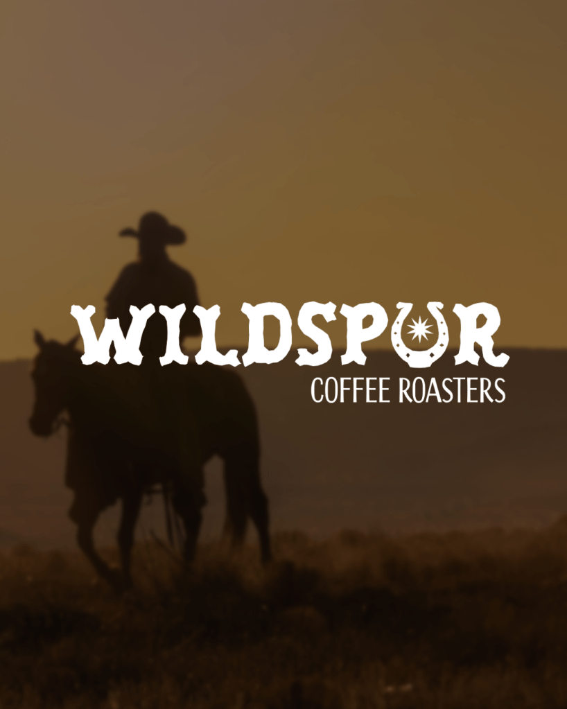
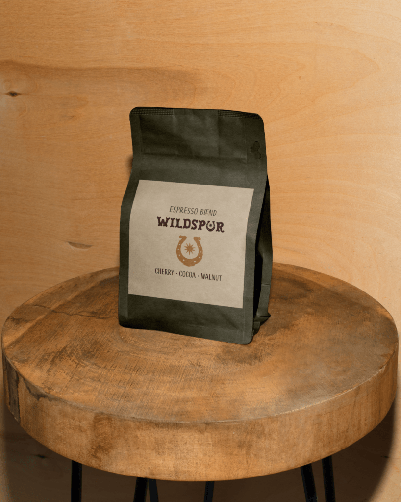
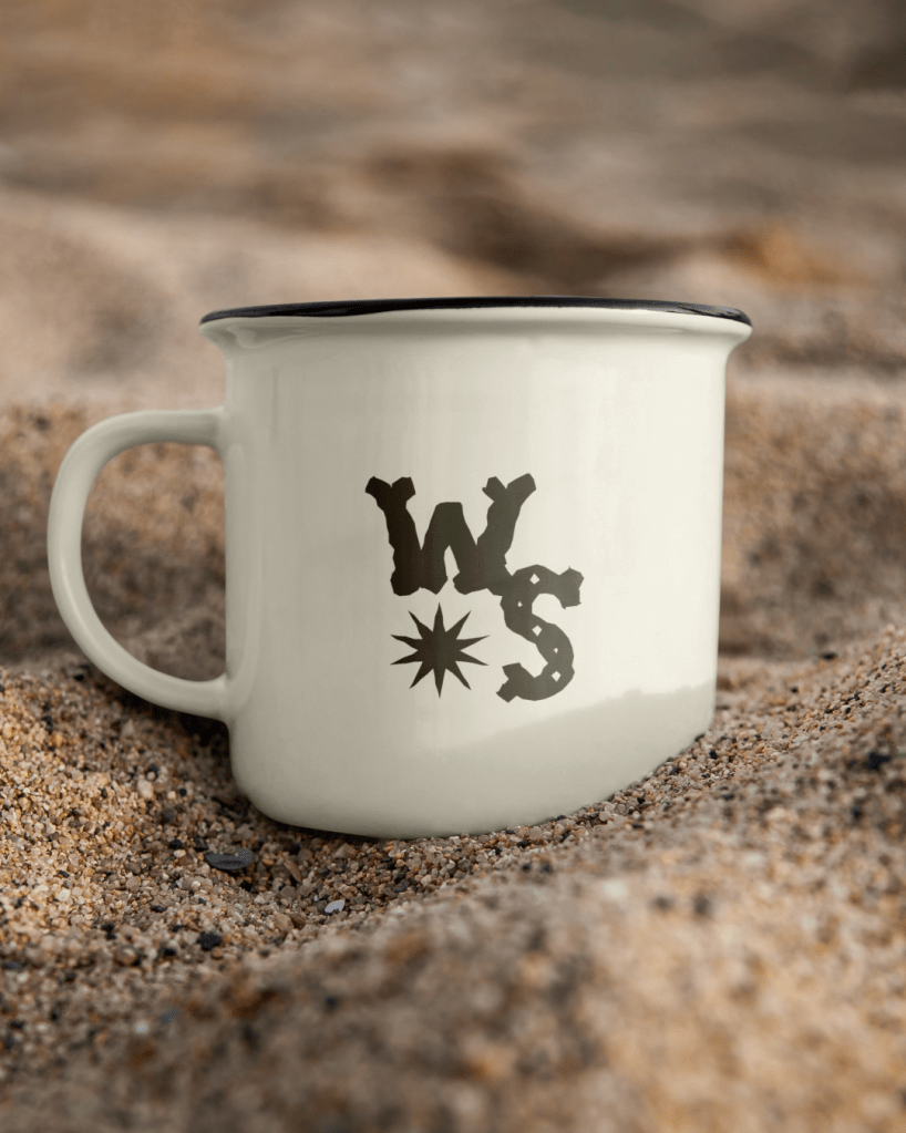
Wildspur Coffee Roasters
Wild Spur Coffee is a small-batch coffee roaster and café rooted in western trail culture and outdoor adventure. The goal was a visual identity that would reflect their passion for handcrafted coffee, slow-living, and the grit of life on the trail.
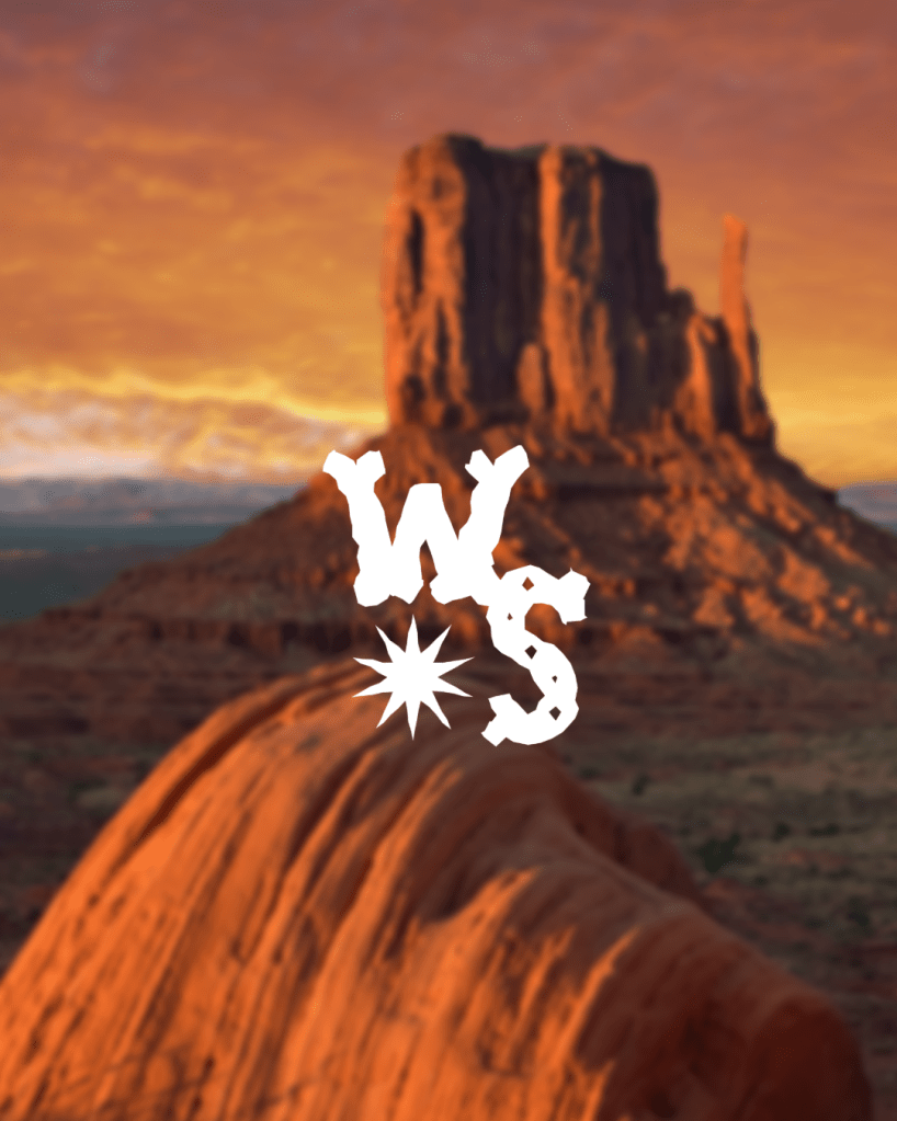
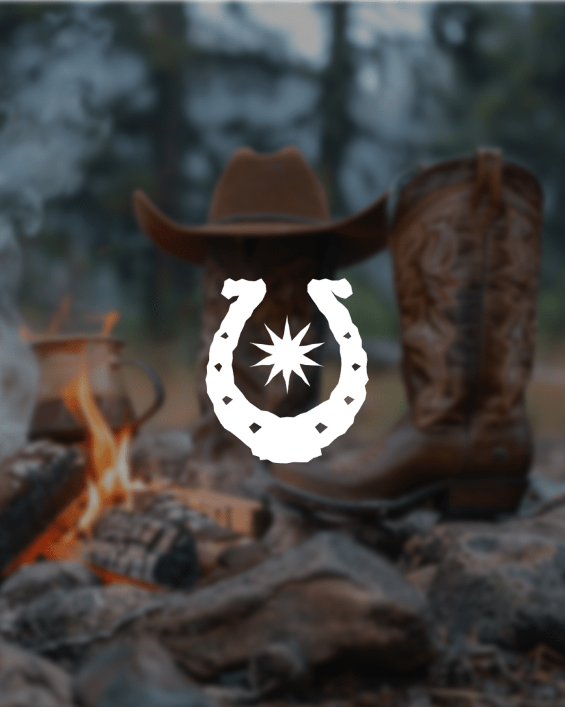
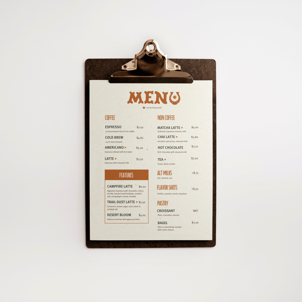
The result is a rugged yet refined brand system that captures these values through warm, earthy tones, vintage-inspired typography, and subtle textural details. The primary logo evokes movement and heritage, while the supporting visuals lend themselves to a range of applications from enamel mugs, coffee bags, menus, and beyond.
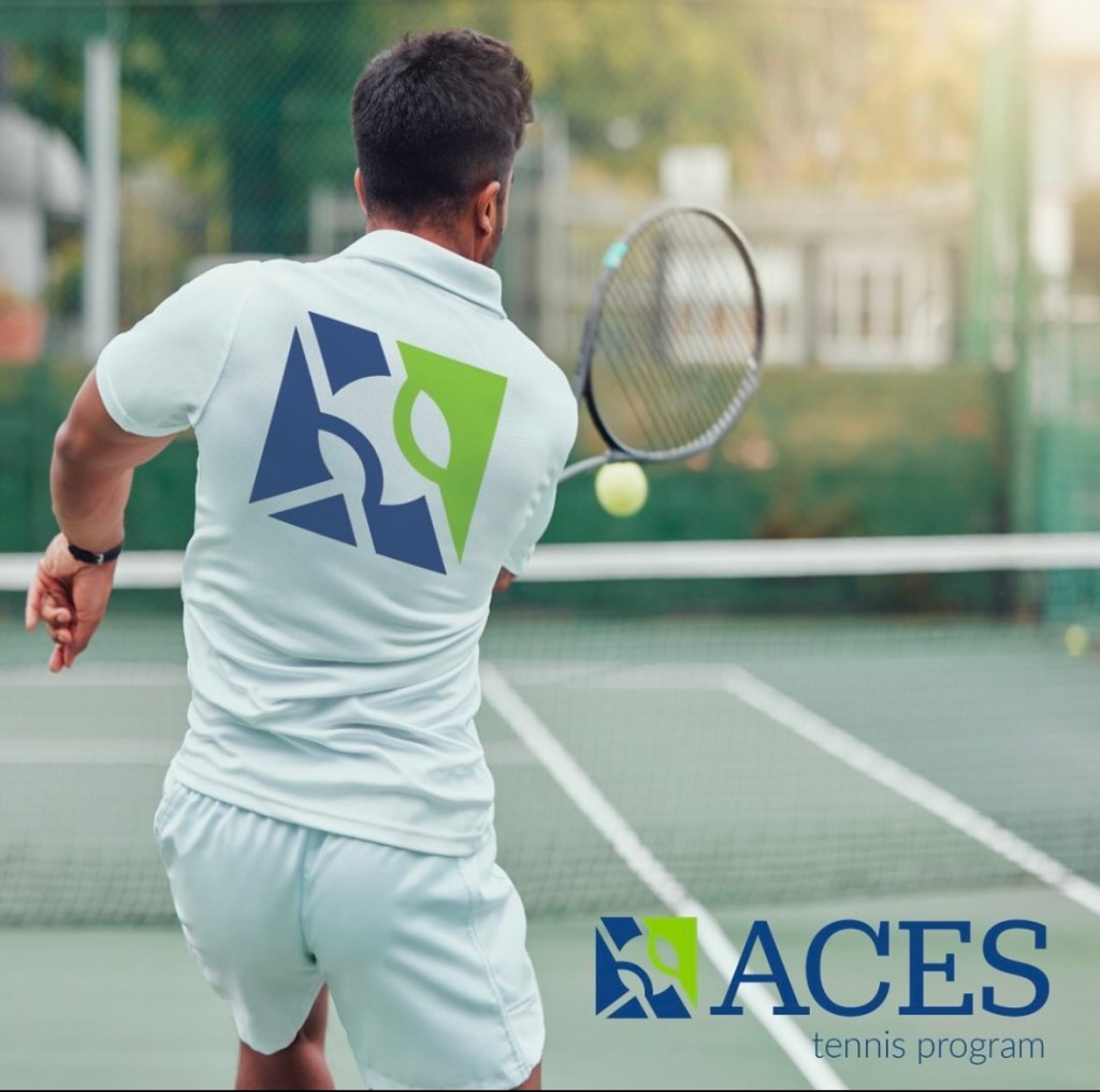
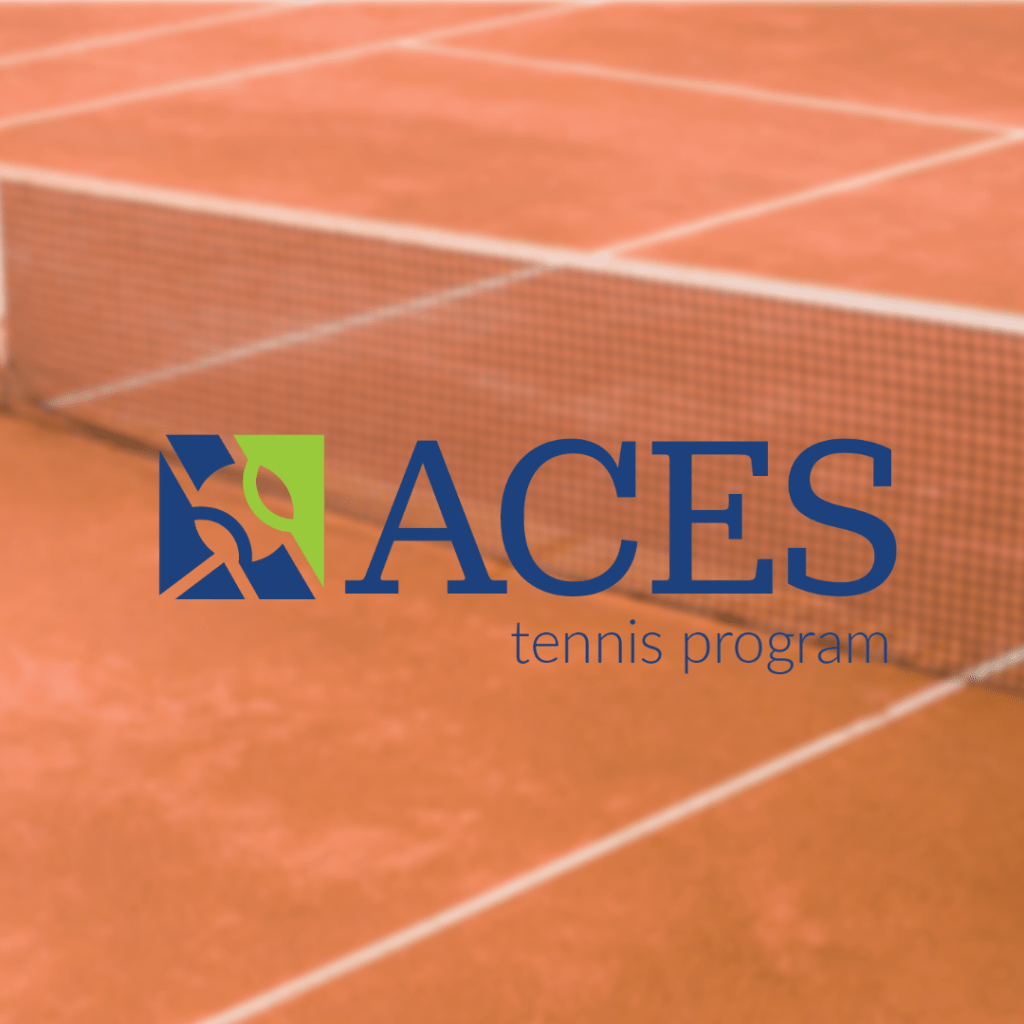
ACES Tennis Program
The ACES Program, facilitated by Penn State University, oversees all junior tennis programming offered through Penn State Campus Recreation. I was tasked with developing a clean, approachable logo that aligned with the university’s brand guidelines while still giving ACES a distinct identity.
To achieve this balance, I paired a classic serif typeface evoking the heritage and tradition of tennis with a contemporary sans serif pulled from the university’s brand kit. The result is a logo that feels both familiar and fresh, reflecting the program’s connection to Penn State while appealing to a new generation of players and families.
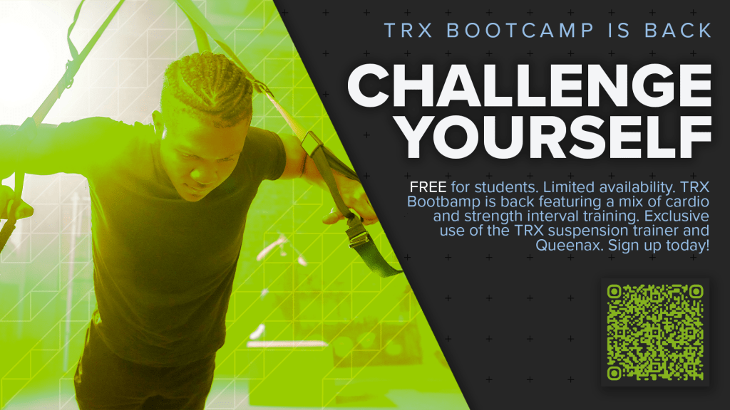
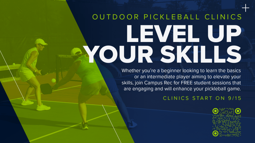
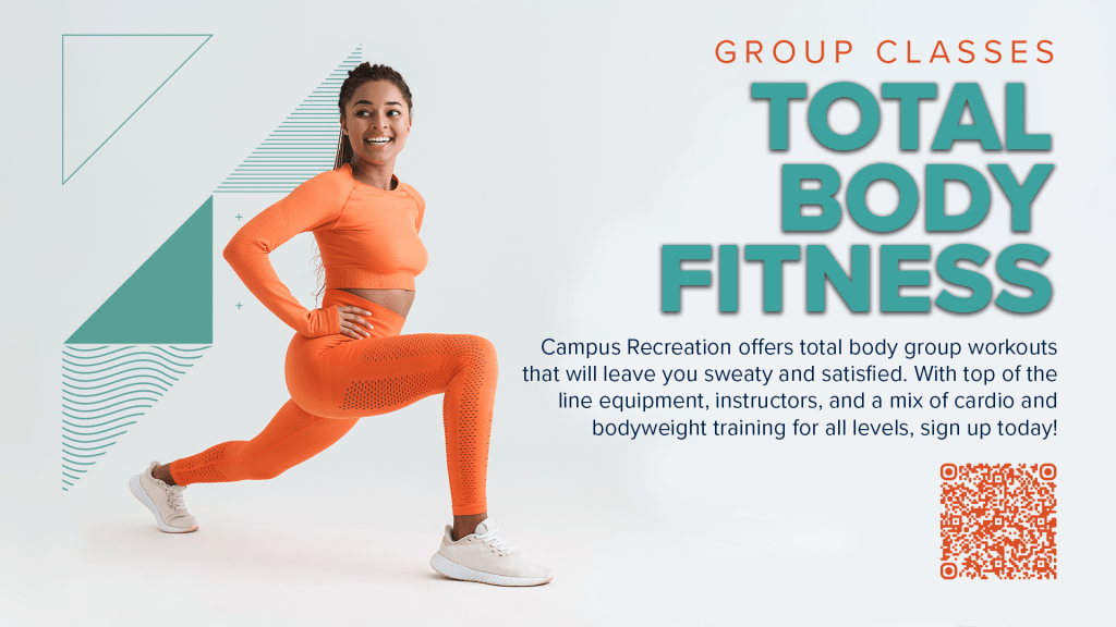
Penn State Campus Recreation
I produce various digital assets for Penn State Campus Recreation to promote a wide range of events from intramural tournaments to wellness classes. I design flexible graphics for Instagram and digital signage used across campus spaces on Fusionwave Systems. These all could adapt to changing event details while staying visually unified.
The designs reflect Penn State’s visual identity while incorporating bold typography, motion-friendly layouts, and vibrant imagery to capture student attention both online and across campus screens. Each asset is tailored to be clear, engaging, and easy to update by the internal team.
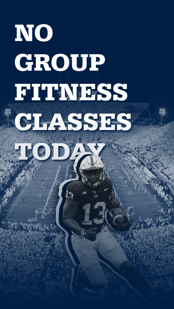
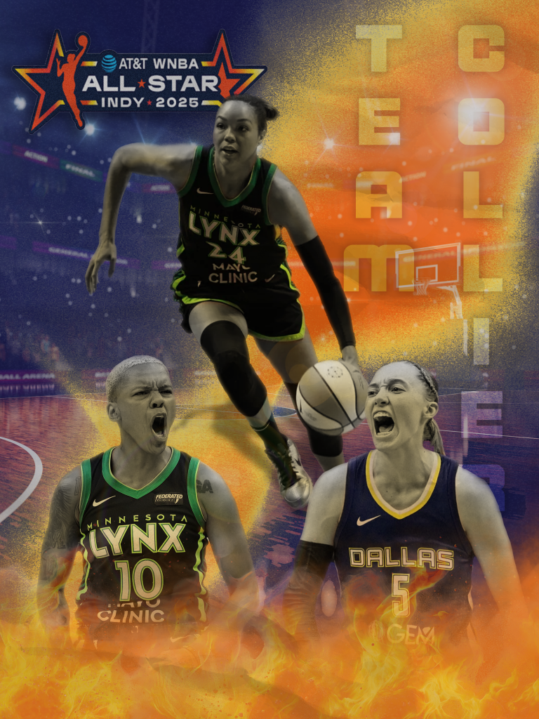
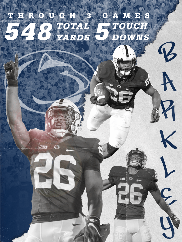
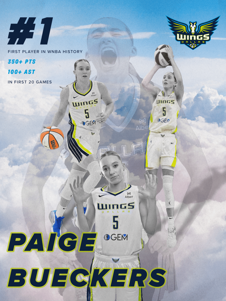
Sports Graphics
This collection of one-off sports graphics showcases my ability to create high-energy, event-specific visuals across a variety of athletic contexts. Each piece was designed to quickly capture attention, communicate key details, and evoke the spirit of the sport whether for a community tournament, youth league, or social media spotlight.
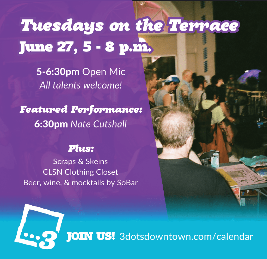
3 Dots Downtown
(In collaboration with Calliope Creative Consulting)
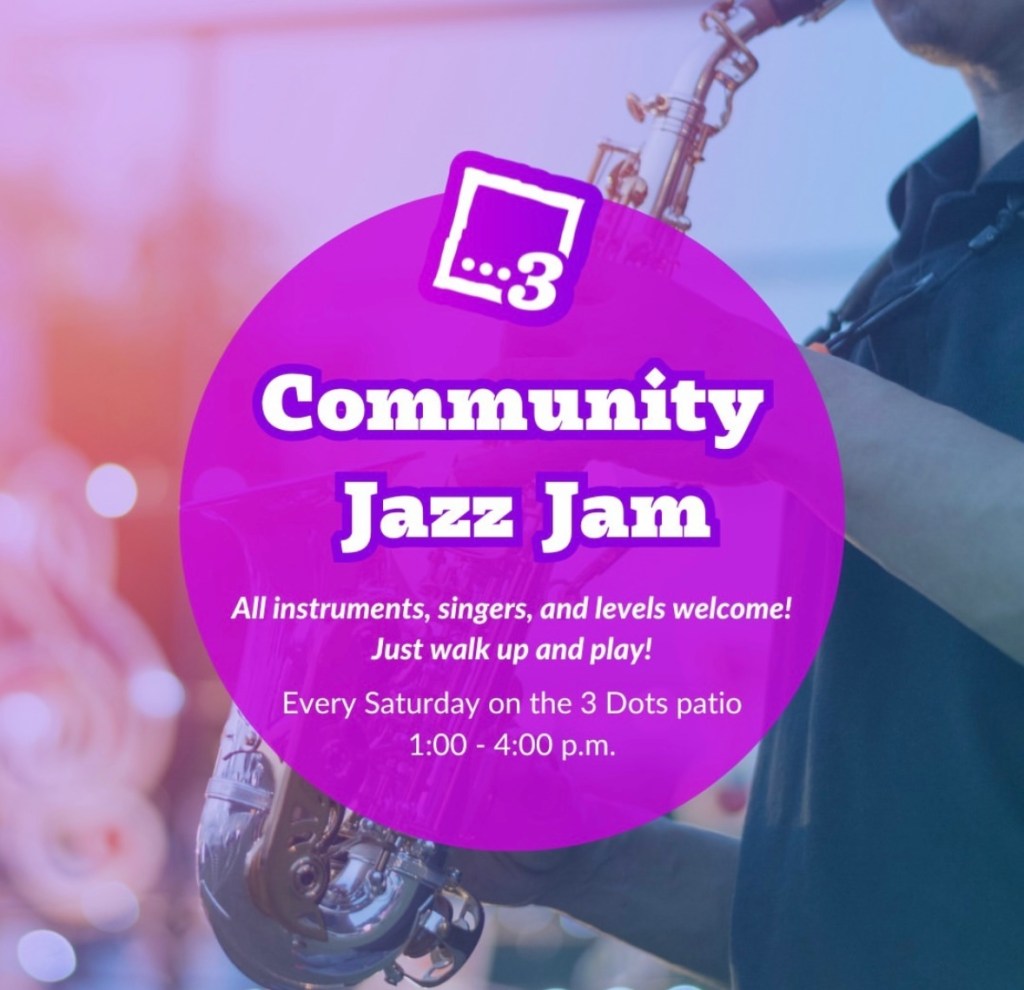
3 Dots Downtown, a creative community hub in Central Pennsylvania, needed a series of weekly social media graphics to promote their rotating events. The challenge was to capture the space’s welcoming, artistic, and inclusive energy while ensuring event details were easy to read and visually compelling on fast-moving social feeds.
I developed bold, eye-catching Instagram posts using a set of custom in-house templates composed by our senior designer + marketing director but reimagined each week with vibrant colors and collage-inspired elements to feature the weekly performers. These graphics reflected 3 Dots’ eclectic, people-first identity while maintaining mobile-friendly layouts and brand cohesion. This project highlights my ability to breathe new life into existing design systems by creating fresh, original content that remains consistent and on-brand.
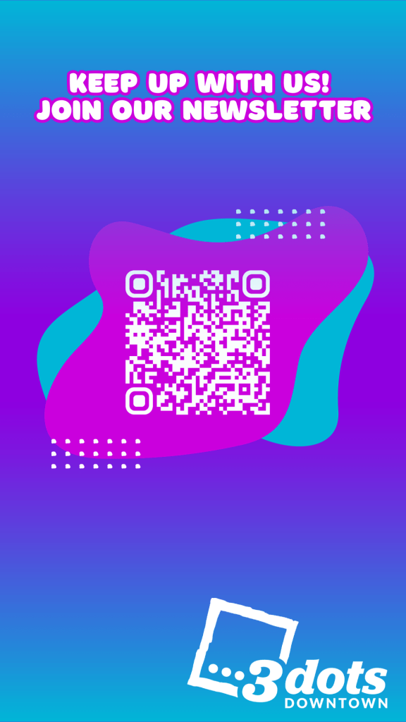
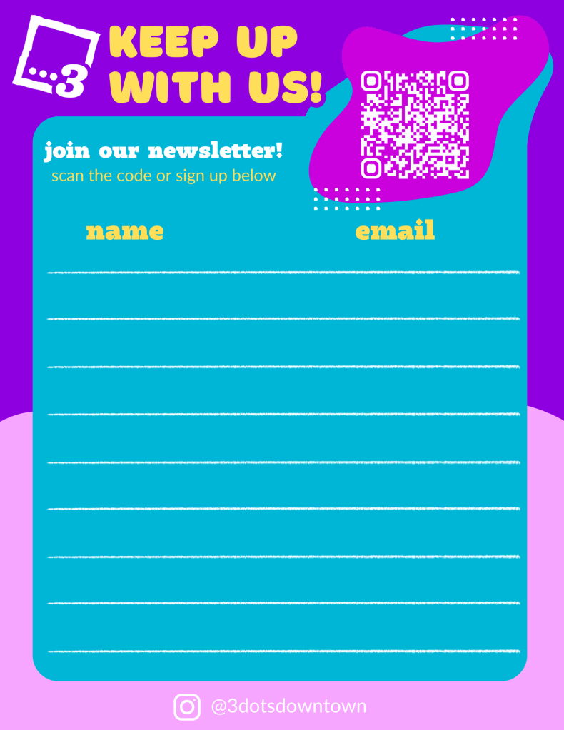
I designed custom newsletter sign-up sheets for 3 Dots Downtown’s in-person events to help grow their community and keep attendees connected. The layouts reflect the brand’s creative, inclusive spirit while remaining simple and easy to use. These sheets strike a balance between inviting design and practical functionality, encouraging engagement during live events.
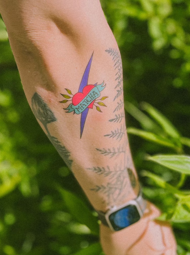
Thunder Thunder Tea
(In collaboration with Thunder Thunder Tea)
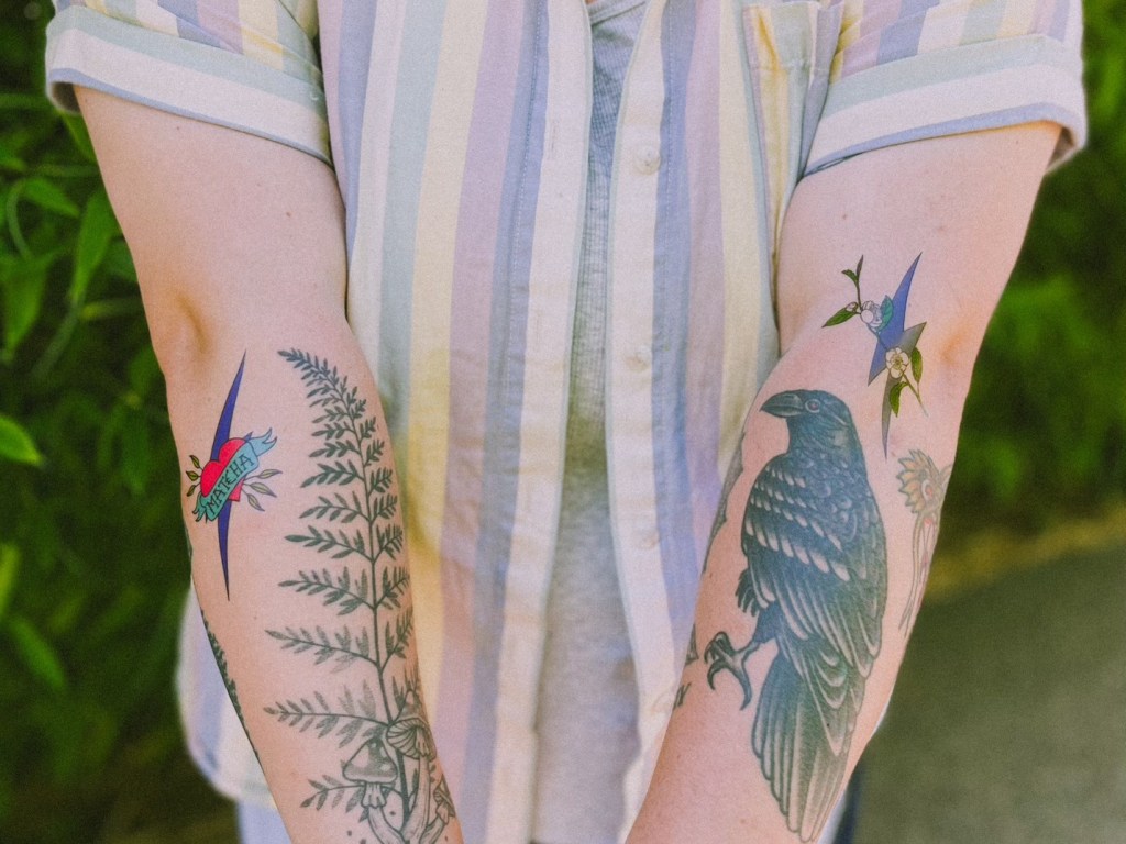
Thunder Thunder Tea is a women and Asian-owned tea brand known for blending serious tea culture with playful, community-driven vibes. I was brought on to create a series of stickers and temporary tattoo designs that could be used for pop-ups, customer giveaways, and collaborations with local artists and vendors.
The illustrations needed to feel bold, fun, and a little irreverent while still connecting to the brand’s deeper identity rooted in care, culture, and expression. I leaned into hand-drawn, energetic lines with whimsical elements that celebrate queer joy, cultural pride, and Thunder Thunder’s signature chaotic-but-intentional spirit as well as some new designs using pre existing brand assets that feel fresh yet familiar.
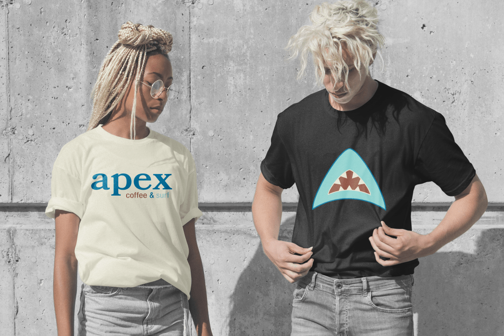
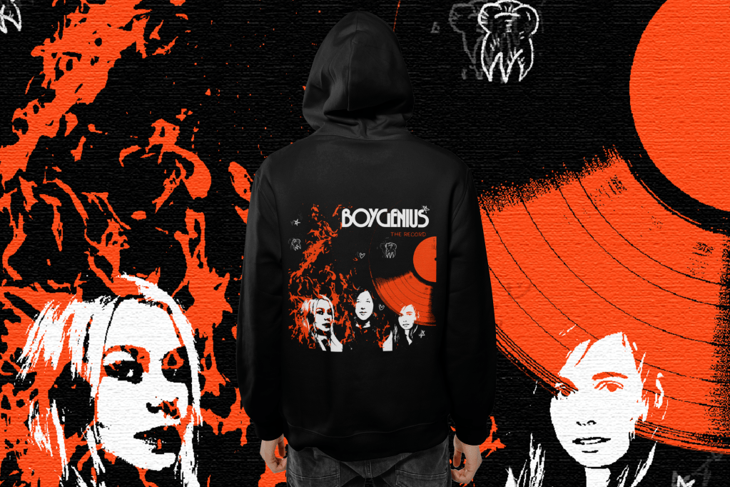
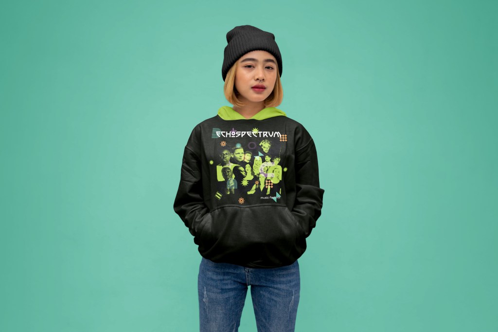
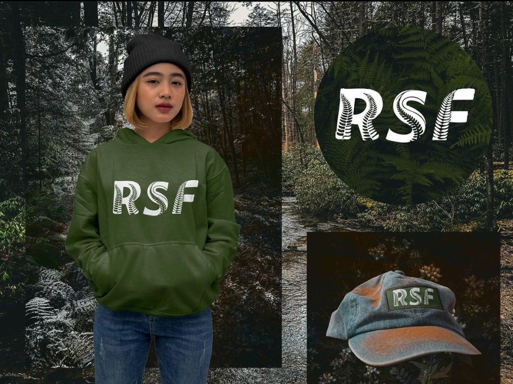
Apparel + Other Merchandise Design